Maybe you are assembling your user interfaces with Bootstrap components? Or maybe you prefer to handcraft all styles in pure CSS? Let me introduce Tailwind CSS – a framework that has gained a lot of traction lately – as a third way to implement your designs using the utility-first approach. How does it work, and how does it change the way we style our applications?

CSS Framework Approaches
Vanilla CSS
One way to style an application is to not use a CSS framework at all. I call this the write from scratch approach:
- You write your own styles and classes.
- You create your own conventions (or follow existing conventions like BEM or SMACSS).
This means you have full control, but for the price of writing everything yourself. And it requires a good amount of CSS knowledge and also discipline to not end up in an unmaintainable big pile of CSS.
Component CSS Frameworks
At the other end of the scale, you could benefit from a component CSS framework. I call this the works out of the box approach:
- You use predefined component and utility classes.
- You inherit conventions provided by the framework.
- You add new styles reactively.
On the upside, you achieve quick results. Conversely, you usually end up with heavy customizing and CSS overwriting, to adjust the components to your needs. Another criticism is that pages using such a component framework tend to all look the same. And in the end, the user has to download a huge library with your custom styles added on top.
Bootstrap, Materialize, Foundation or Bulma (and many more) are representatives of this class of frameworks. They range from full-fledged frameworks providing any component you could think of, to more lightweight variants.
Utility CSS Frameworks
There is a third way that somehow sits in between the two extremes. I call it the midway approach:
- You use predefined low-level utility classes.
- You build your own components (no component classes are provided by the framework).
- You create a well thought-out library proactively.
Although you create your own components, there are conventions and handy abstractions such a framework provides. And as a side effect, it leads to writing less (or no) CSS code.
The representatives in this class of frameworks are Tailwind CSS, TACHYONS (the Tailwind CSS predecessor) or Basscss.
The Atomic CSS Methodology
The midway approach that Tailwind CSS implements, is based on a methodology called Atomic CSS (or Functional CSS). The term has been coined in 2013 by Thierry Koblentz in a Smashing Magazine article titled Challenging CSS Best Practices. This article describes the pain and the pitfalls of the traditional CSS model, and comes up with a new way of styling via markup that Koblentz calls a „game-changer“.
At its core lies the principle of creating a closer relationship between styling and content to achieve more „predictable, reusable, maintainable and scalable code“.
But what does that mean?
Atomic CSS is the approach to CSS architecture that favors small, single-purpose classes with names based on visual function.
Let’s Define Exactly What Atomic CSS is
By using these generic utility classes like .pt-4 (to add some top padding) or .flex (to create a Flexbox container), the styling can be achieved completely by using classes in the HTML markup. This results in less abstraction since the styling can be observed right in the markup. It also implies that the scope of the styles is dramatically narrowed (styles are „sandboxed“ to the nodes they are attached to, there are no contextual or descendant selectors) and that the styles become portable (content can be moved around without losing its styles).
As further advantages, it can avoid CSS redundancy (i.e. avoid repeating the same CSS rules in multiple places), it can stop CSS growing (i.e. break with the nature of aggregating more and more styles as a project ages) and it can avoid dead styles.
All this enables better caching, because the CSS rules become generic and immutable (they rarely change), and can be shared.
Fair enough though, the CSS bloat that can be circumvented in this way will be turned – to some extent – into HTML bloat. But the highly repetitive class names in the markup are very well suited for gzip-compression.
Finally, it is important to note that Atomic CSS is not banning „semantic“ class names like .button. As Thierry Koblentz puts it:
(…) we are restricting the „component“ approach to the few cases in which it makes the most sense.
But more on this important topic further down. Let’s dive into Tailwind CSS first.
Working with Tailwind CSS
About the Framework
The Tailwind CSS project has been started by Adam Wathan. It saw its first alpha release in 2017, and its first stable release in 2019. It is licensed under the terms of the MIT license and is implemented as a PostCSS plugin. Basically, it is a set of directives to be used in your CSS files.
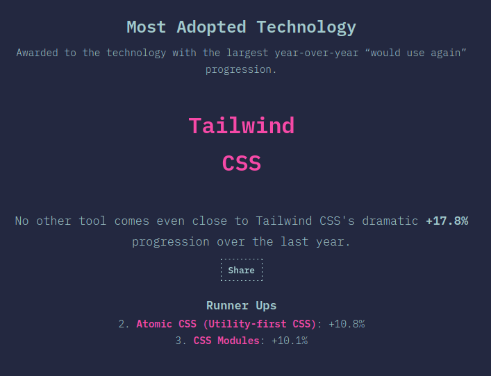
The traction it has gained is crazy – according to the The State of CSS 2020 survey, it has been selected as the „Most Adopted Technology“ (with Atomic CSS being second):

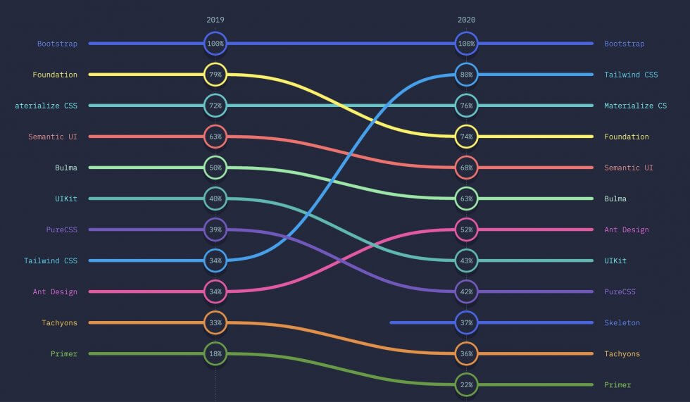
It has established a usage fraction of 33% and risen from 34% to 80% awareness within one year:

Configuration
To setup Tailwind CSS in your project, follow the Installation chapter of the official documentation.
You will need to:
- Install Tailwind via NPM.
- Create a PostCSS configuration file and register the Tailwind plugin.
- Create a Tailwind configuration file with the Tailwind CLI (where you can customize aspects like breakpoints, fonts, color palette, spacings, variants, plugins or the purging mechanism).
- Include Tailwind’s directives in your CSS file to inject Tailwind’s styles.
- Build the CSS (depending on your setup there are different ways to achieve this step).
With the default configuration, the generated CSS is over 3MB in size. For a production build, you should therefore always tree-shake unused styles so they won’t get shipped to the user. This will bring down the build size to a few kilobytes. Tailwind provides an easy to configure integration of PurgeCSS to achieve this. Consider the Optimizing for Production chapter of the official documentation for more details on this topic.
Example
Quoting the example from the Utility-first chapter of the official documentation, I’d like to show how implementing a design with Tailwind CSS differs quite substantially from a traditional CSS approach.
In the cited example, the following notification component is built:

Traditionally, you’d use semantic class names and custom CSS to style the elements:
<div class="chat-notification">
  <div class="chat-notification-logo-wrapper">
    <img class="chat-notification-logo" src="/img/logo.svg" alt="ChitChat Logo">
  </div>
  <div class="chat-notification-content">
    <h4 class="chat-notification-title">ChitChat</h4>
    <p class="chat-notification-message">You have a new message!</p>
  </div>
</div>

<style>
  .chat-notification {
    display: flex;
    max-width: 24rem;
    margin: 0 auto;
    padding: 1.5rem;
    border-radius: 0.5rem;
    background-color: #fff;
    box-shadow: 0 20px 25px -5px rgba(0, 0, 0, 0.1), 0 10px 10px -5px rgba(0, 0, 0, 0.04);
  }
  .chat-notification-logo-wrapper {
    flex-shrink: 0;
  }
  .chat-notification-logo {
    height: 3rem;
    width: 3rem;
  }
  .chat-notification-content {
    margin-left: 1.5rem;
    padding-top: 0.25rem;
  }
  .chat-notification-title {
    color: #1a202c;
    font-size: 1.25rem;
    line-height: 1.25;
  }
  .chat-notification-message {
    color: #718096;
    font-size: 1rem;
    line-height: 1.5;
  }
</style>
With Tailwind CSS, all styling is realized with utility classes within the markup itself:
<div class="p-6 max-w-sm mx-auto bg-white rounded-xl shadow-md flex items-center space-x-4">
  <div class="flex-shrink-0">
    <img class="h-12 w-12" src="/img/logo.svg" alt="ChitChat Logo">
  </div>
  <div>
    <div class="text-xl font-medium text-black">ChitChat</div>
    <p class="text-gray-500">You have a new message!</p>
  </div>
</div>
Looking at this markup might disturb you at first, but I strongly suggest to try it out and see how it feels to work this way.
Variants & Responsive Design
Tailwind CSS offers the concept of variants that can be used to prefix utility classes. Here are some examples:
<button class="bg-blue-400 hover:bg-blue-300">
  Different background on hover (pseudo-class variant)
</button>

<button class="md:text-lg xl:text-xl">
  Larger font-size, the bigger the screen (responsive variants)
</button>

<button class="hidden lg:inline-block">
  Only visible on large screens (responsive variant)
</button>

<button class="lg:hover:bg-red-300">
  Different background when hovered on large screens (combined variants)
</button>
There are pseudo-class variants (like hover:, focus:, disabled: and first:) and there are responsive variants (sm:, md:, lg: and xl:). The latter represent mobile-first breakpoints that can also be customized.
Extracting Components
Let’s assume we have a styled button with some colors, paddings etc.:
<button class="bg-blue-500 hover:bg-blue-700 text-white font-bold py-2 px-4 rounded">
  Button
</button>
You may want to use this button throughout your application without having to duplicate the stylings over and over.
I want to emphasize here that utility-first does not mean utility-only. It merely means that it’s the default choice, but components still can be extracted where it really makes sense.
Let me raise the law of extracting components at this point:
- Primary choice for component extraction:
Don’t (avoid premature abstraction) - Secondary choice for component extraction:
Create a JavaScript component in the frontend (e.g. a React, Angular or Vue component) or a template partial in the backend (e.g. a Rails partial) - Tertiary choice for component extraction:
Create a component class with the @apply directive
So in practice, component classes are essentially appropriate for simple elements like buttons or form inputs.
To extract a component class that incorporates all utility classes, add it to your CSS file:
@tailwind base;
@tailwind components;

/* Custom components */
.btn-blue {
  @apply bg-blue-500 hover:bg-blue-700 text-white font-bold py-2 px-4 rounded;
}

@tailwind utilities;
And then use it just as you’d expect:
<button class="btn-blue">
  Button
</button>
Enough theory…
To get a better feel for how Tailwind CSS changes the styling process, check out the following screencast where Adam Wathan implements the design of a card component:
Conclusion
Working with Tailwind CSS requires some mental shifts. It is essential to choose abstractions wisely, and you should work a lot with JavaScript components or partials (which is a good idea anyway). Working with Tailwind’s gradual (opinionated) spaces, sizes and colors is quite satisfying, since it narrows down the choices and enables a kind of design while you write approach (ideal for prototyping).
Although, when it comes to building custom components, I still have some unanswered questions: How about more complex components like a datepicker? How about accessibility with custom components, especially when developers don’t have a lot of experience in accessibility?
In summary, it is interesting to see how Tailwind CSS improves the focus by putting styling and markup in one place. The project has super high quality documentation and a lot of really great screencasts. I predict that Tailwind CSS is most probably going to play a role in the CSS framework ecosystem of tomorrow.
Further Resources
- Official Tailwind Docs
- Screencasts by Adam Wathan
- Challenging CSS Best Practices (article by Thierry Koblentz, Smashing Magazine)
- Let’s Define Exactly What Atomic CSS is (article by John Polacek, CSS-Tricks)
- In Defense of Utility-First CSS (talk by Sarah Dayan at dotCSS 2019)
- Why I Don’t Like Tailwind CSS (video by Chris Hawkes)
Title image: Pixabay
